Sunday, April 30, 2017

Lorenzo's Bedroom 2017 Update


My son's room (roughly 9 ½ x 10), has a queen sized bed, closet desk, some storage stools, and 2 horizontally stacked lack units with bins as his clothing storage. Gray walls, and Blue and Green accent colors. 


I sat down with him and asked what he wanted to update:

-Dark Gray walls
-More clothing storage, with traditional sized drawers, without sacrificing floor space and his queen sized bed.
-Graffiti and urban decor


We made a vision board


We painted all the walls a dark gray and all the trim a bright white. I purchased a queen platform bed with 12 standard sized drawers in the base that provides ample storage, and placed the head of the bed on the largest wall with a large graffiti mural over it. 

For additional storage and "night stands" we used a total of 12 Ikea Trones storage units around the walls and flanking the bed and placed fiberboard that I cut and painted white, on top of it to serve as a counter tops. We mounted the floating shelves on both walls perpendicular to the graffiti mural. I painted the door black and mounted a mirror and over the door basketball hoop.


We painted the closet desk walls all black, and added turntable decals to the custom built desktop. For lighting I hung string lights around the inner door frame and ceiling of the closet, along with a desk lamp, and mounted the TV on that wall over the desk. I purchased a black leather and chrome bench for seating and shoe storage, and place the drum set in the corner to the left of the desk.
 I used a pleated window shade that allows light to filter through.


FINAL PRODUCT


Sunday, April 23, 2017

Sabby's Bedroom Update 2016

Floor Plan


My daughter's room (roughly 7  x 11 ) with a large window, double sliding door closet, and the entry door all on different walls. She has a daybed, a desk, a lack storage unit, and 2 large pieces (drawers chest and armoire) from her original nursery furniture as her clothing storage. 

Paisley prints, Turquoise walls and bright colored accents.


Click here to see on Ikea Share Space!

For more pictures click here!


I sat down with her and asked what she wanted to update:

-Colorful Floral Wall paper, white walls
-Reading nook
-Closet Desk
-More clothing storage, with traditional sized drawers


We made a vision board and new layout


We kept the daybed in the same spot and the new Ikea Malm dresser on the wall across form the bed with the TV mounted over it. I added Overlays on the top row and diamond hardware to the 2 bottom rows of drawers. There is not enough room for a reading nook so I purchased a hanging chair and placed it next to the bed  where the desk used to be with a bright pink round shag rug under it. We purchased a colorful floral wall paper for the walls across the bed, closet and where the hanging chair is. The wall where the bed and windows are were painted white.  I hung various picture frames, signs, and ceramic flowers over the bed to create a colorful collage. We pulled everything out of the closet, painted it all black, and built a custom shelf and desk with graphic and glass top in the closet.  I added a strip of the colorful wallpaper under the shelf over the desk, and for lighting I hung string lights around the inner door frame and ceiling of the closet, along with a desk lamp. I mounted 2 Ikea Tornes storage unites and a rolling cart for her art supplies under the desk. I painted her door black and mounted a mirror and geometric animal door hooks. I used pleated window shades that allows light to filter through and mounted the mirror to the vertical window frame in between.

Final Product


Wednesday, April 27, 2016

2016 Living & Dining Rooms Sophisticated Makeover!


I recently updated our upstairs hallway & stairwell and wanted to continue that same sophisticated, glamorous look for our downstairs living areas, including converting "The Blue Room" into a formal dining room


Our current living room (10 ½ x 16) has a large black leather sectional, colorful accent chairs, 2 modern black side tables, and to conserve floor space, a wall mounted 3-D Smart TV and floating wall mounted TV stand with console and DVD storage.  We have a 60" espresso slat bench  with a custom cut piece of glass on top of it as our coffee table that is large enough for the sectional, but doesn’t compromise floor space. When the kids want to play the Wii or Kinect the “coffee table” slides right under the Floating TV Stand and there is plenty of space for them to jump around. I installed a panel bracket system (the same I used for my panel curtains) to the wall above the in-wall AC unit, and hung a large poster print so that whenever the AC wasn't in use I could slide the poster in front of it.  To store all the video games and controllers I built a small 2 shelf unit the same width of the wall next to the opening between the rooms, painted it the same color as the wall, and attached stainless steel legs to raise it so it would clear the baseboard heaters. We have light gray walls with black, white, blue, and green stripes throughout the living room. I painted a larger bottom stripe with various shaped colors broken up by silver lines on the wall leading to the stairs, and hung picture frames. I have 3 Ikea Nils stools along the wall for additional seating. We also have a small modern fish tank on a tall acrylic stand against the wall next to the stairs landing.

The living room is joined to our Family room, or as we call it “The Blue Room”, by a large 7 ½’ wide opening.  “The Blue Room” (12x 13 ½) is our computer room /office/ dining room/ music room/ art studio /game room. The current Blue Room configuration is very open, with the computer desk, drum set, a few shelving units and a bar height table with 6 stools. The ceiling fan light was not as bright as we sometimes need so I also purchased a floor lamp, which I placed on top of the "Art Supplies" shelving unit with a dimmer switch. I ordered Cardboard Safari animal heads and had the kids make their own designs on them and hung them on the wall surrounding the TV.

Before


Click the images below to enlarge


The living room didn’t need much change aside from paint and some accent pieces, but The Blue Room needed a complete makeover!  


I created these vision boards and floor plan:


Living Room Vision Board


Blue Room Vision Board


I painted the wall between the entryway and stairs the same dark gray I used for the upstairs hallway and stairwell. I purchased a console table and large round mirror to go on the wall. I cut and glued plywood cut outs to our bland plywood door and painted it glossy black, and trim a bright white. I painted over all the stripes with the same light gray paint I already had on the walls in the main living room.  I replaced the 2 blue and green accent chairs with Tufted Light Gray Linen chairs, and replaced the colorful pillows and throw on the sectional with black, white, and gray -with metallic silver and gold pillows and a faux white sheepskin. The colorful curtain panels were replaced by dark gray panels and a pleated white shade. The small 1 bulb ceiling light we currently had was too dim for the size of the room so I replaced it with a 5 spotlight ceiling light. We now have a lot of natural light well into the evening and ample light at night.

I spray painted all our decorative accents either gold or silver, including one of the black side tables I placed the “AK 47” lamp I made on.

“The Blue Room” was officially changed to “The Dining Room”
I painted the walls the same light and dark grays used in the hallway and living room, painted the closet door glossy black, and all the trims bright white. I replaced our metal blinds with the same light filtering pleated white shades I used in the living room, and mounted our TV onto the middle beam of the double window sill, and installed 2 double spotlights over the window. I replaced the ceiling fan with the same 5 spotlight ceiling light I used in the living room.

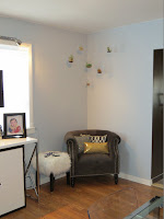
I converted the smaller shelving unit that used to store the art supplies into a TV/CPU/Router/Game console storage unit. I cut 2 fiberboard panels, painted them white, and used Diamond knobs I had left over from my Master bedroom makeover and mounted them using self-closing hinges.  I purchased a set of 2 nesting console tables and placed the shelving unit under the larger of the 2, and centered them under the TV in from of the window. Now our television serves as the CPU monitor as well, and I eliminated our old Bulky CPU Desk! I purchased 2 Chesterfield Dark Grey Tufted Velvet Arm Chairs to flank the new “TV console stand”. I used one of the white fur stools I made as a small side table/ foot rest, and hung floating succulents of varying shapes and sizes at different heights, from the ceiling over one of the chairs.

I combined the 2 bigger shelving units I had (1 horizontally and 1 vertically) to make one large storage/display/buffet cabinet. I painted more silver and gold shapes onto the already painted black and white doors. I painted the inside of the open shelves gold and added lighting strips. I had a large wood framed mirror that I spray painted gold and hung it over the horizontal unit. I also spray painted some of the hexagon pieces of a clock gold and hung it on that wall.

I used the smaller of the 2 nesting console tables as our desk, and placed the other 2 white fur stools I made under it. On the wall over the desk I made a collage of the varying picture frames I had.  (I spray painted some of them gold). I re purposed our utility cart as bar cart and purchased a new dining room set with an expandable glass dining table and 6 modern clear dining chairs that look spectacular!

After


 The whole family is very pleased with our new living and dining rooms.  I was able to maintain the many functions we need and have ample space to eat/play/hang out, without compromising the sophisticated and glamorous look I wanted!  

Click here from more pictures